TAKE NOTE
Crafted by you. Curated by Herff.
Here, we turn the reporting over to you to tell us the intent and inspiration behind the book.
Then, we’ll share some thoughts. When you’re ready for the world to see your book, DM us
@HJyearbook. We’re saving space just for you.
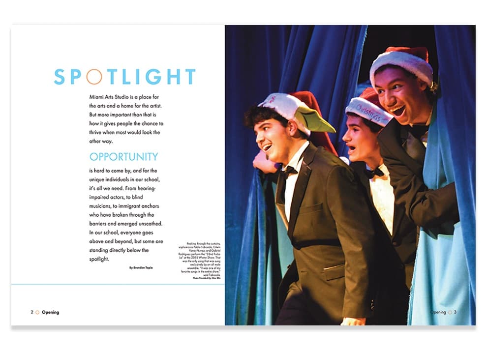
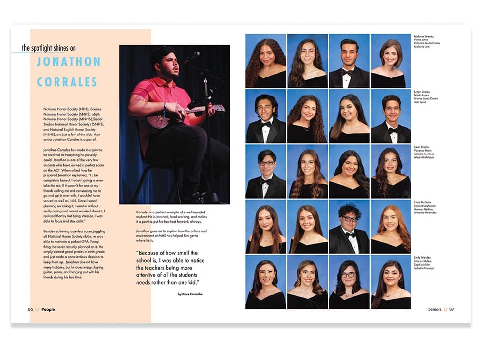
MIAMI ARTS STUDIO 6–12 @ ZELDA GLAZER
Enchanted | Miami, FL
Advisers: Alejandro Gonzalez
Editor: Damian Garcia, Isabella Cuzan
“Since we are the newest arts high school of Miami, the spotlight has been placed on us. So, we showcased our students and faculty and how they shine throughout our school and community.” — Damian Garcia
“It was heart-warming to see an entire school year’s worth of hard work paying off as the yearbooks were cracked open. I genuinely believe that all of our staff was on cloud nine, seeing our peers react so positively.” — Isabella Cuzan
THE PLAIN WHITE COVER might have seemed confusing at first, but when it came in contact with sunlight, the theme appeared in school colors orange and blue. The muted palette continued throughout the well-designed volume showcasing mods, profiles and unifying content, all included to shine the spotlight on a greater mix of students. So smart to use a crowd-pleasing technique to literally represent the theme. There’s no way the message could be more clear. You DO have to step into the light to achieve the greatest impact. And when you do, everyone can see your brilliance. //YBKhq

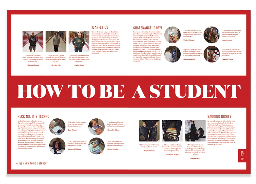
AMERICAN FORK HIGH SCHOOL
The American | American Fork, UT
Adviser: YBraden Boss
“It was my first year advising at this school. We studied older yearbooks from our school — and decided to hit reset. We wanted to bring back the legacy of the yearbook. That meant not having a verbal theme, but highlighting the book name instead. We used our school color and a classic font to honor our heritage. This book was a change from the past. The staffers were selected because they were talented designers or writers or photographers, and they worked together in teams in those task-specific roles. That meant we could tell the stories that captured the year. The staff was totally proud when we got the book and they saw the reaction of the school.” — Braden Boss
THE VISUAL IDENTITY of this book is undeniable, as is its appeal. From the cover in, the staff’s goal of creating a book that would remain a favorite affected every aspect of the publication. Equally nuanced and bold, their decisions combine to create a volume packed with delights for every owner. Those who favor powerful images were considered alongside their peers who wanted more verbal coverage and others who yearned for strong design. Talk about a crowd-pleaser! //YBKhq

