ALL ABOUT INSPO
How to avoid the blank slate with inspiration
Some years in the life of an adviser are magical. The student leaders — after several years in the program — arrive back at school prepared from summer workshops. They come with an amazing theme packet featuring a great concept, inspired design, compelling opening copy and a working coverage plan.
Most years, though, begin somewhere lower on the spectrum between magical and disastrous.
The computer transformed the yearbook, but it can also impede creativity. Too often, I see writers staring at blank screens.
Go out and talk to people. Read something.
I have grown tired of designers staring at an empty spread, wanting to invent a new layout — but stuck looking through the same Pinterest designs. Without guidance, students may produce something they have seen before — or are comfortable with. And more often than not, it looks a lot like the previous year’s book.
Ideas don’t emerge from the mind like Athena coming from Zeus’ head.
When creating photos or layouts, look, and then look some more! If you want to write, read.
Ideas do not emerge from a vacuum — you need to internalize the visual and verbal around you before your mind can synthesize those raw materials into powerful yearbook content.
In other words, students need to find inspiration. And that need for inspo can come at different times for different purposes.
It may be a piece of writing that contains the message and/or tone the editors wish to convey.
All the elements of design: Type, photo packaging, internal and external separation space, color and texture are all around us.
Let’s say you have a strong verbal, with a powerful theme statement, and perhaps even some opening copy — which is where you really should start — but you find the students emulating the design of last year’s book or others from your exchange library.
Encourage them to look elsewhere for different design ideas.
The tried-and-true method is — and was — a design notebook. I have had students who compiled notebooks from their first year on staff, and by the time they became editors, they had dozens of fresh ideas. Digital versions live on designers’ devices worldwide.
The key sources for visual ideas? Magazines, other print materials, web design and online sources. I would avoid Pinterest because there is too much old content and duplicated design.
My favorite source is the public library.
The Los Angeles County Library subscribes to about 120 magazines, and the design inspo for our 2019 book came from the library’s collection.
And don’t forget, not all inspiring design works. If you have developed the verbal part of the theme, you need to consider the tone and make sure it fits with the style of the graphics. A quiet, contemplative or reflective tone does not lend itself to bold typography and colors.
The 2018 Pilot themed, “Imagined at Redondo, Made by You,” began with design. An editor-in-chief was drawn to art books and other sources, which eliminated a dominant photo and instead used a series of photos tied together with a colored background. Both editors agreed on tone, which they presented in a slide show to the class: “Confident, but not arrogant. Skilled, self-assured, individual, sophisticated.”
While they still struggled with opening copy, verbal inspiration was found from Apple’s “Designed in California by Apple” campaign.
Everything came together with that book.
Its tone, design, typography and writing all worked together. The editors had a vision, and they were certainly able to translate it.
The 2019 yearbook vision was harder to create. They started with a desire to develop a diversity-based theme — yet, they had no design ideas.
Too much staring in front of a computer.
They didn’t even understand the point of the theme. They really needed help.
We tried to decide on a tone so we could find some verbal and visual inspiration. Looking back, 2017’s book was bold and braggy; 2018 was thoughtful and confident. Someone suggested that we try something fun. The staff looked kind of glum and one editor-in-chief said, “We’re not fun.”
Then someone showed the editors an old ad from Domino’s Pizza. It was simply a run-on sentence describing many great sports moments during which people were eating pizza. I encouraged my editor to use that copy as inspiration for a stylistic imitation.
The results were fabulous — and fun.
Soon after, they coined the phrase, which would become our theme: “Not Just One Thing.”
Even with a verbal concept and two workshops completed, the students had no design worth using. I specialize in writing, concept, coverage and photography — everything but design. My editors usually take the lead there.
Using my online library access, I started looking for fun visual ideas. The art and science of adviser involvement could be a whole other story. But in this case, I knew my staff needed my help with some teaching and inspiration.
I collected examples of what I thought was “fun design” into a slideshow for the staff. We talked about the typography, photo packaging, color use and reporting techniques. Right away, they were focused and more enthusiastic.
The light bulbs were on. ideas flowed.
There were lots of ideas to choose from, but they knew their mission was to create a concept empowered by visuals — which then enhanced their verbal idea. On top of that, they had to make it clear for readers. The discussions we had made it easy for them to isolate the devices they liked and figure out how they could work together.
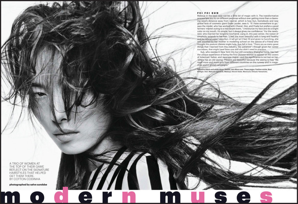
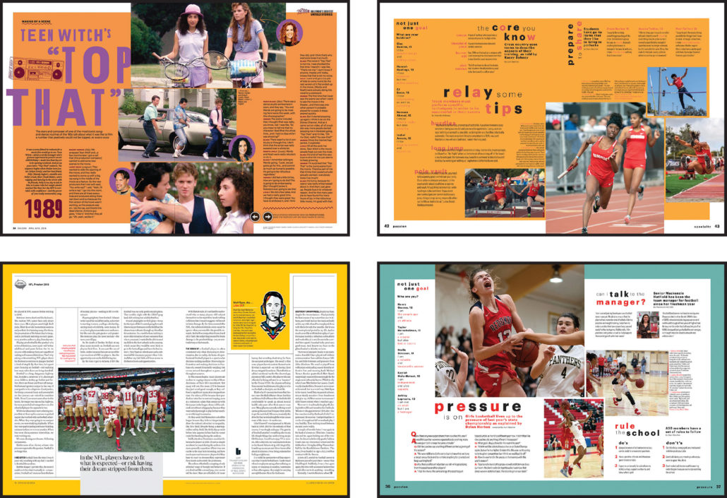
The basis of our work was formed by three examples from Allure. The next three — while “fun” — did not fit in either tone or design with the Allure examples.
Even with an inspo path, challenges can continue.
Once the students find techniques/colors/fonts they like, their jobs don’t end. In fact, in their enthusiasm, they often want to include every good idea, even ones that clash — in terms of look and tone. Sometimes the problem is the tendency to include too much, which occurred with some regularity when books went to all color. Just because you have unlimited options does not mean you should use all of them.
Have students limit their choices with parameters. As an adviser, you need to ask questions: Does that fourth color seem to work with the others? Does this type package work with that one? Do circles and hexagons with color backgrounds send the same message?
They usually catch on quickly. And mine did.
One hint from me led them to come up with the verbiage for a successful umbrella organization. With this, there was an improved energy in the room as we talked about ways to carry the theme throughout.
Maybe they didn’t believe they were inherently fun (of course they were), but we certainly had a lot of it.
MITCH ZIEGLER, CJE
Redondo Union HS • Redondo Beach, CA

MODERN MUSES, a spread in Allure magazine provided the visual inspiration for Redondo Union’s 2019 volume. After struggling to find visuals that worked together to reiterate the verbal theme, the team found their verbal voice. The challenge then became finding fitting visual inspiration. Thorough analysis helped staffers make choices regarding the use of type, space, color and other devices while creating variations on the work that inspired them.

“Not Just One Thing,” but the overall vibe evolved from the ideas the design team considered (on the left) and adapted (to the right). The staff used alternating versions of the “placemat” layout presented in the magazine as well as the two-color, all lowercase type treatment to give spreads a uniform — but not repetitive or boring — look and feel. The theme’s visuals begin on the cover and are carried throughout the book on theme and coverage pages alike.

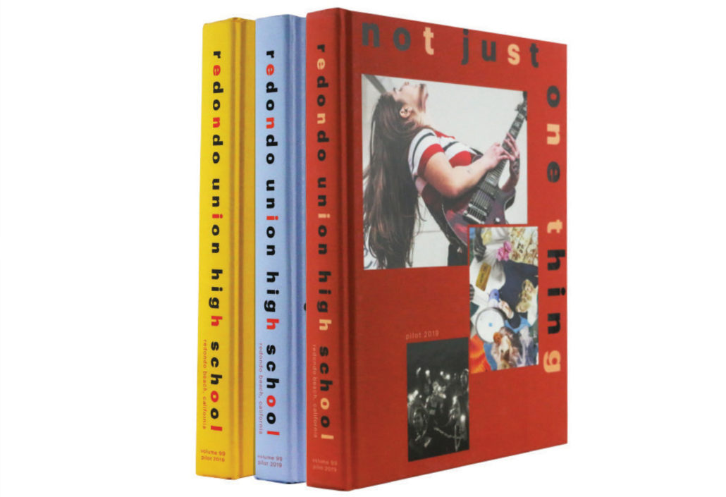
Form meets function. Lots of schools jump at the chance to offer split-cover options, but Redondo made the intentional choice because it tied into the theme, “Not Just One Thing,” perfectly. See more cover and spread inspiration here.
TAKE NOTE
Hear from other yearbookers as they tell us the intent and inspiration behind their books. Then, we’ll share some thoughts, too. Check it out here.
