

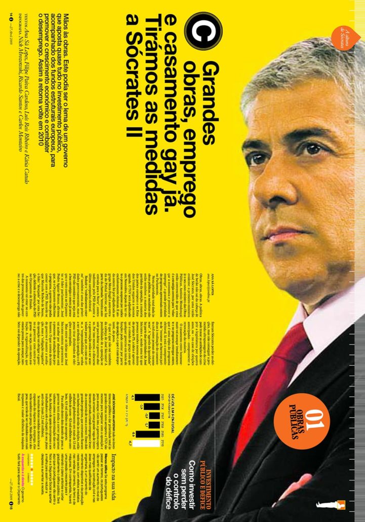
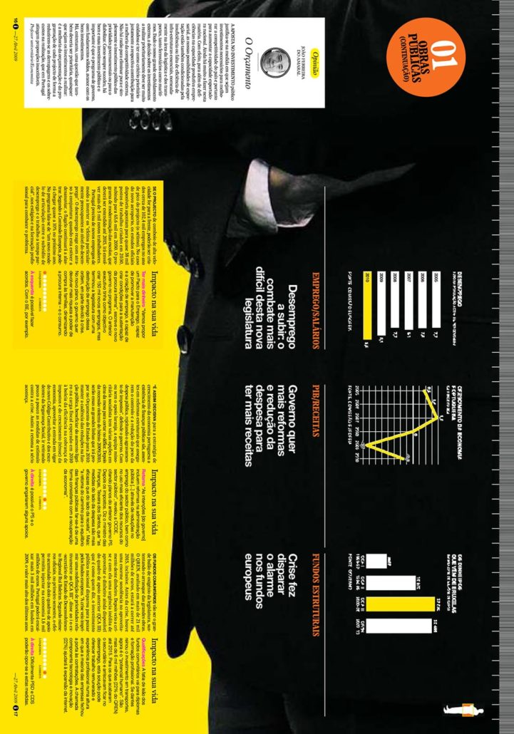
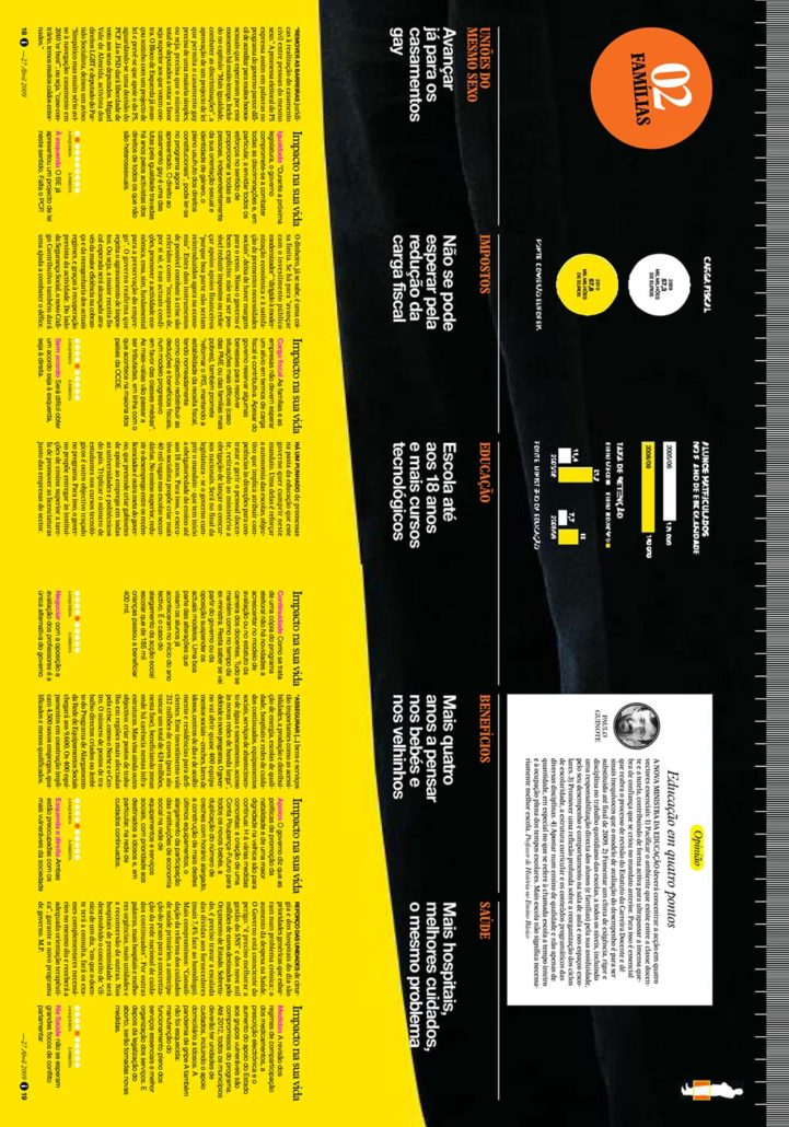
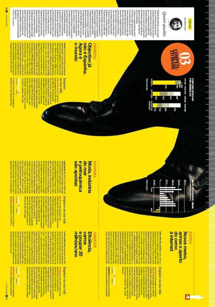
“The Prime Minister addressed Parliament regarding his agenda. Think State of the Union. The Portuguese word for his point-by-point delivery translates roughly ‘to measure.’
That made me think literally, so we needed to create a news package that held them together.
What if we measured him?
We confirmed his height and decided to run a life-sized, full-body image of him across the needed four spreads. Of course, we needed a ruler across the top. Once we had the foundation down, we could simply layer the mods about each ‘measure’ atop the art.
We started the process about 2 p.m. and finished that package around 10 p.m. The next morning, it was telling the story of his speech in a more interesting and consumable way.” – Nick Mrozowski
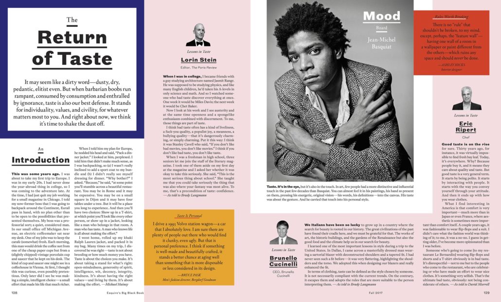
Modern styling finds a home in this spread from a feature about the rules of good and bad taste, published in Esquire magazine.
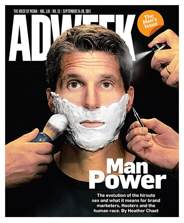
Getting picture perfect, the image for this Adweek cover was a mash-up of two iconic Esquire covers.
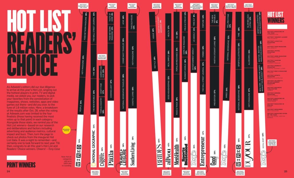
High contrast colors this spread from Adweek, which breaks down print winners from its annual Hot List.
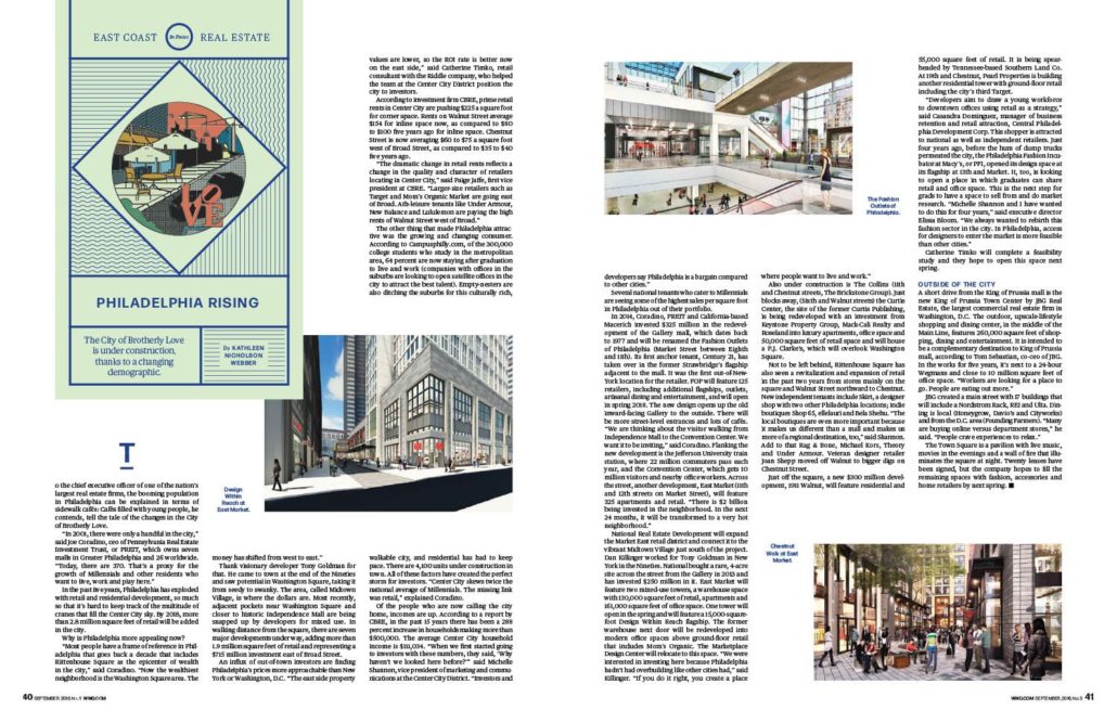
White space highlights this spread about east coast real estate that was part of a larger feature published in WWD.
He loved drawing as a child and by the age of 10, Nick Mrozowski was shadowing his father, an architect. He had a notebook filled with drawings and developed his drafting skills. He thought he knew what he wanted to be when he grew up.
In middle school, he joined yearbook, but a scrapbook style and club format didn’t inspire him. So he continued exploring his interest in architecture, until he met Lynn Strause, CJE.
Strause, his freshman English teacher, was also the yearbook adviser at East Lansing High School in Michigan, and while yearbook journalism was technically open only to juniors and seniors, she invited him to join the award-winning staff as a sophomore.
To begin, he was an ads guy, and his affinity for process paid off. Literally. Inspired by the autonomy of his role and the potential to make a difference, he created an ad sales packet he has referred back to more than once since he left college. With systems and tracking for accountability, the staff found greater success than ever before. But Mrozowski didn’t want to be the ads guy long-term.
NEW PASSION
“Graphic design had the technical aspects of architecture that appealed to me, but was more creative. And more immediate,” he said.
He found he loved type and space and solving problems visually. He served as a co-editor both his junior and senior years, and those two volumes were East Lansing’s only books ever to win both a Gold Crown from CSPA and a Pacemaker from NSPA — and East Lansing was the only school in the nation to achieve that distinction in both 2001 and 2002.
Under the guidance of Strause, the 2001 National Yearbook Adviser of the Year, Mrozowski developed a respect for design foundations, understood the role of organization and learned about conceptual development.
He had an eye for detail that puzzled others. And Mrozowski thought maybe yearbook was something he could do as a career.
COLLEGE YEARS
So he headed to nearby Michigan State University, where he majored in journalism while specializing in studio art and graphic design.
Instead of joining the yearbook staff, Mrozowski worked on The State News, MSU’s daily paper. When he became editor-in-chief, he was the first design student ever to fill the role. The Society for News Design named him Student Designer of the Year in 2004 and 2005 for his work there.
After an internship at The Virginian-Pilot in Norfolk, he graduated from Michigan State and took his first full-time job in Virginia.
“They’d just done a redesign, and they had a reputation as one of the best-designed papers, so it felt like a great opportunity,” he said.
GLOBETROTTER
Then another interesting opportunity arose — becoming the founding creative director of a new publication in Portugal.
He didn’t speak Portuguese, but he was intrigued by the concept behind i (pronounced ‘E’), as in information. A daily magazine-style publication, the full-color tabloid would be stapled and trimmed to allow bleeds, but published on newsprint using a heat-dried process that sealed the ink to the paper.
At 25, he became i’s design leader and explored the concept of the visuals driving content in a news publication.
And then, it was like he found himself back in the world of yearbook.
Though the coverage teams mirrored the sections in a traditional newspaper, the plan was for detailed, varied and interesting design.
With the proposal of alternative story formats and smaller bits of copy, Mrozowski’s brain went right back to the gridded design he and Strause used for his yearbooks.
In fact, he called her and asked her to share files of the materials they created for Ceniad years before.
Modifying slightly to accommodate for differences in publication size, that same grid still worked, and the separation space made the content easy to consume.
The mod library concept allowed his team to churn out six visually pleasing editions each week.
“It was hard work,” he said. “Design came first, then journalists wrote to fit. Sometimes we had to make adjustments for better coverage, but design was first in the process, and it also came last.”
The staff’s efforts paid off. Readers noticed, and i attracted the younger, more educated and sophisticated audience they targeted.
And — because the staff was young as well — they attracted a market of new readers who appreciated the design to the point that some collected copies.
Awards and medals stacked up and, in its second year, i was named the Society for News Design’s “World’s Best-Designed Newspaper” of 2011.
HEADING HOME
By then, Mrozowski was considering a return to America. He was fluent in Portuguese, but the original editors who drove the concept he loved had moved on.
It was time for a change.
“I wanted to work in New York, so I figured out how to get there quickly,” he said.
During his first week, he landed two interviews. While the hiring process took a while, he was soon creative director for the trade publication, Adweek, where he worked for four years, learning more about the industry, building his impressive portfolio and networking.
He moved on to WWD (Women’s Wear Daily) as the print edition went digital, and he stepped in as creative director of the new weekly magazine, which carries the same name.
Then his yearbook roots became apparent once again.
FREE SPIRIT
“I really like being in charge,” he said. “I enjoy managing projects. I have a lot of ideas, and there’s definitely an entrepreneurial aspect to my personality.”
In 2017, Mrozowski set out on his own. Freelancing, he said, has been amazing.
Gone are the routines and guidelines and the mundane repetition of standardized work. Mrozowski said he’s never bored and loves the variety of projects coming his way. He gets to figure out how to organize everything and make it all work.
“It’s kind of like graduate school,” he said. “I learn something new from each project. It keeps me engaged.”
While he admits that he enjoyed the “free” part of freelancing more in his first year as he was getting started, he now has more call-backs and recommendations. So many, in fact, he has been double-booked for months. He knows that’s not sustainable — and he is looking forward to new opportunities.
“I need to take some time and reorganize,” he said. “So I will be able to take it to the next level.”
What does that look like? Probably a studio or agency which would involve others working with him, larger projects and space dedicated to design. To date, he’s been willing to work on-site with some clients to complete projects on their terms.
Going forward, his mission is more than establishing his own studio.
“I have some projects I want to do. Once the studio is functioning efficiently, I’ll be able to do more.”
Mrozowski has never strayed far from his original passion.
“I owe my whole professional life to yearbook,” he said. “There’s no doubt about it.”
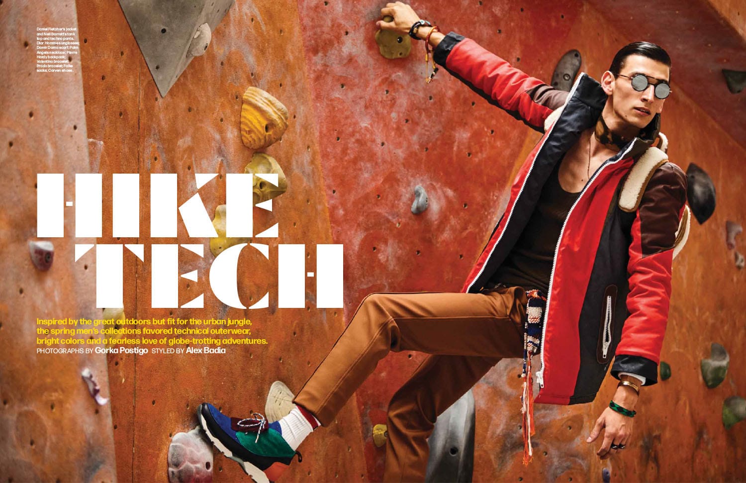
Fashion-forward type and photography are featured on this opening spread about trending fashion from WWD magazine.
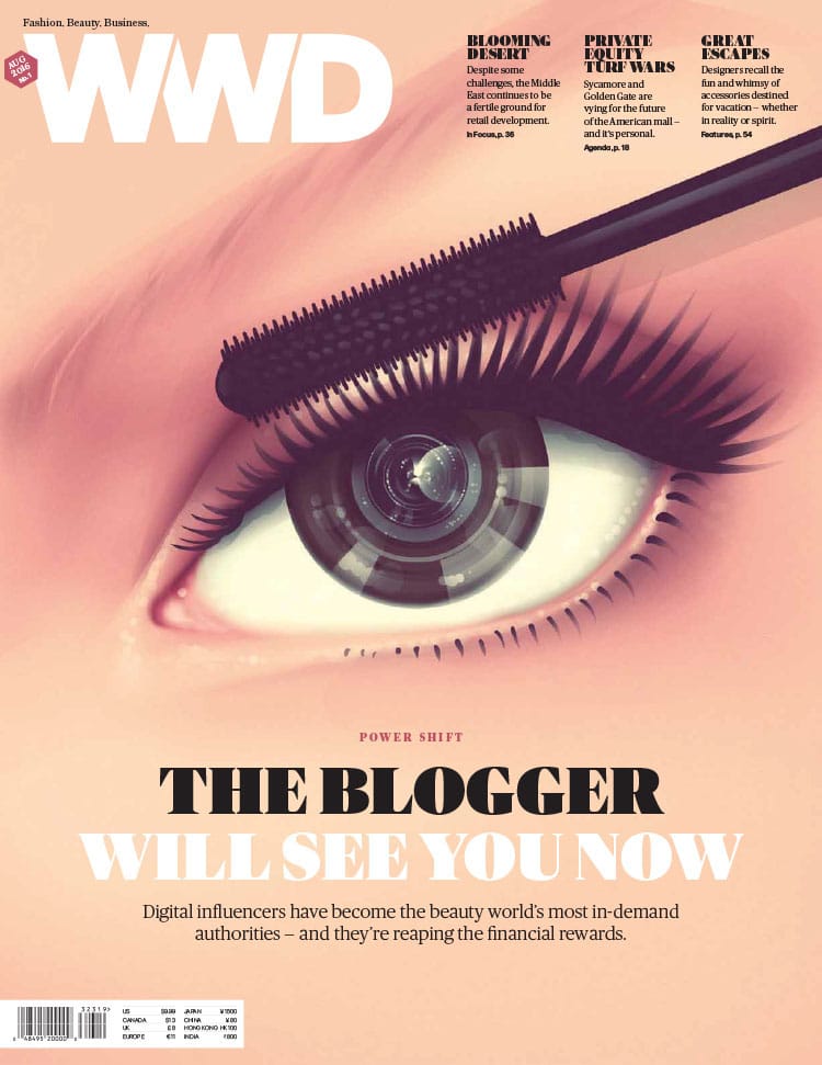
En eye-catching illustration about the power shift of digital influencers in the beauty world takes over the cover of WWD.
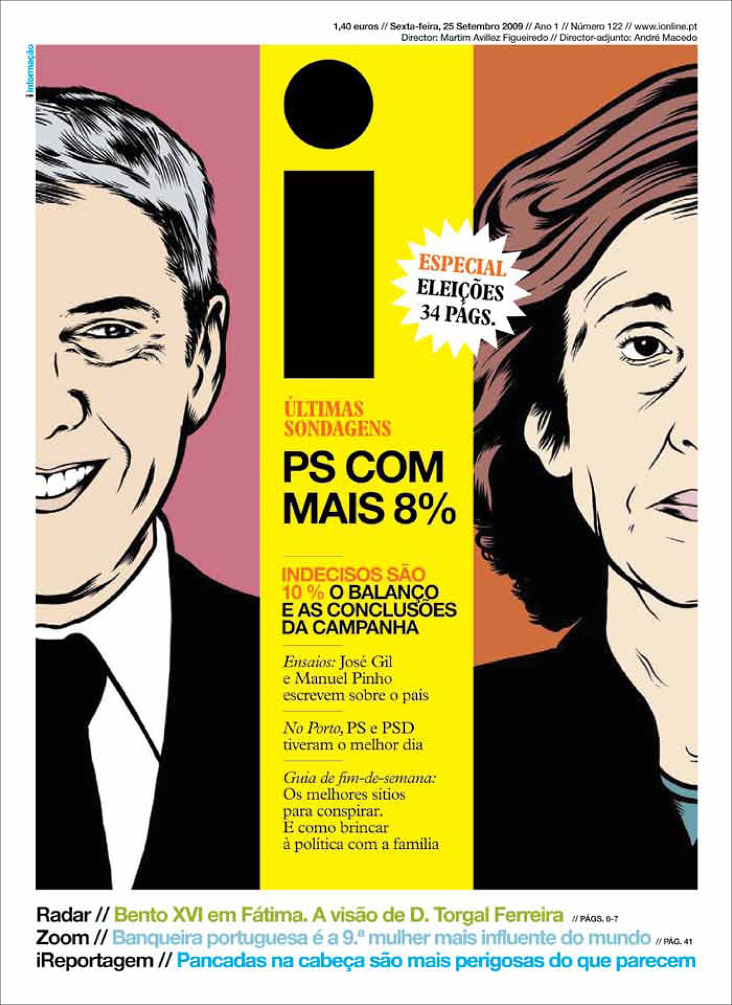
Election coverage graces the cover of the Portuguese publication i, which won world-wide recognition under Nick Mrozowski’s lead.
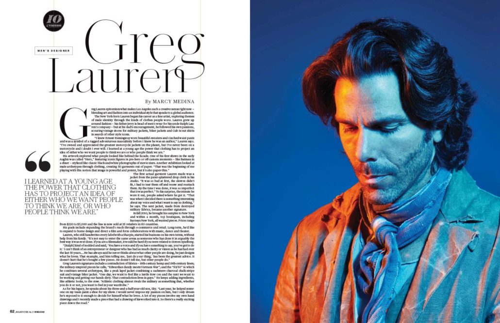
Unique portrait lighting anchors this feature of Greg Lauren, which was part of WWD’s 10 of Tomorrow, which highlighted fashion figures who lead their respective fields.
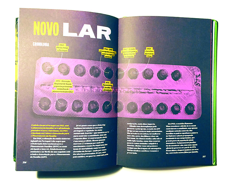
Striking colors fill this featured spread from the book “LX60, a colorful history of Lisbon during the 1960s” which Nick Mrozowski co-created.
