TAKE NOTE
Crafted by you. Curated by Herff.
Here, we turn the reporting over to you to tell us the intent and inspiration behind the book. Then, our experts at YBKhq offer their takes. When you’re ready for the world to see your book, email YBK@herffjones.com. We’re saving space just for you.

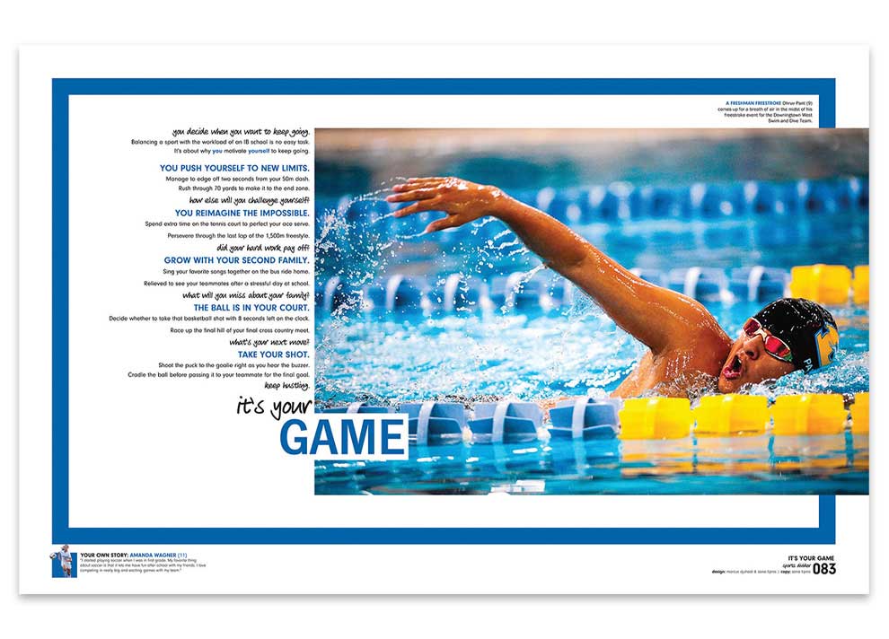
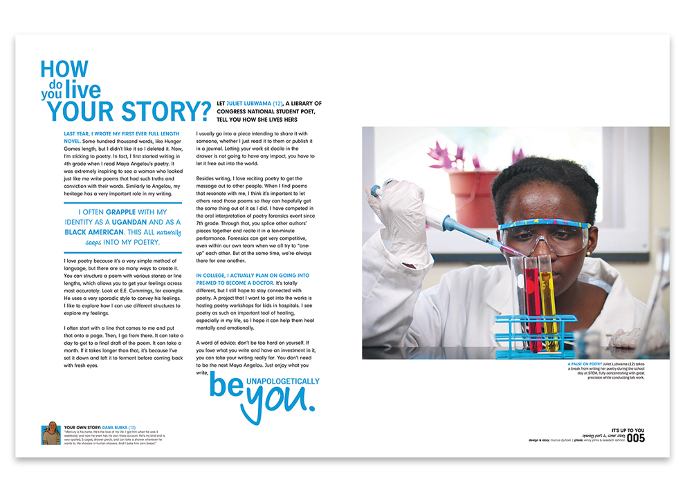
DOWNINGTOWN STEM ACADEMY
Legacy | Downingtown, Pennsylvania
Advisers: Jocelyn Long, Janette Romano
Editor: Marcus Djuhadi
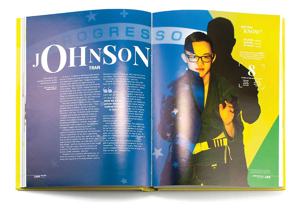
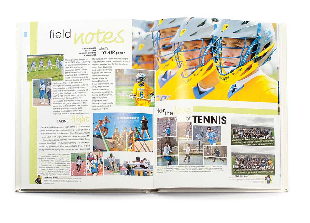
“The cover was tough. We played with the idea of one student, multiple students or no picture at all. As we started developing the rest of the book, we decided since the book was all about celebrating the individual, why not showcase a single student? We chose Juliet because it is odd for a STEM school to have a student poet whose passion is medicine but who loves to write. We looked at our student body to see whose unique stories to tell. We wanted to highlight a handful of those students. We narrowed down our list to one student from each grade and two seniors. We were excited to work with individual students to shoot the perfect photographs to embody their personal stories.” – Areebah Rahman
Not every staff is bold enough to choose a single student to stand alone on its cover, but this concept goes perfectly with the theme, which sets the scene for individual student profiles.Top-notch approach here. The Legacystaff didn’t skimp on color. Vivid hues pulled from the eye-catching photos fueled the design. Strong type contrast is carried from the cover through the entire book. The staff used a fun script sparingly for emphasis — just as it should be — and paired it with a sans serif of different weights and sizes for smaller levels of type nuance. Well done. //YBKhq
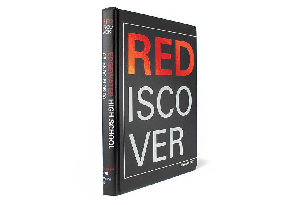

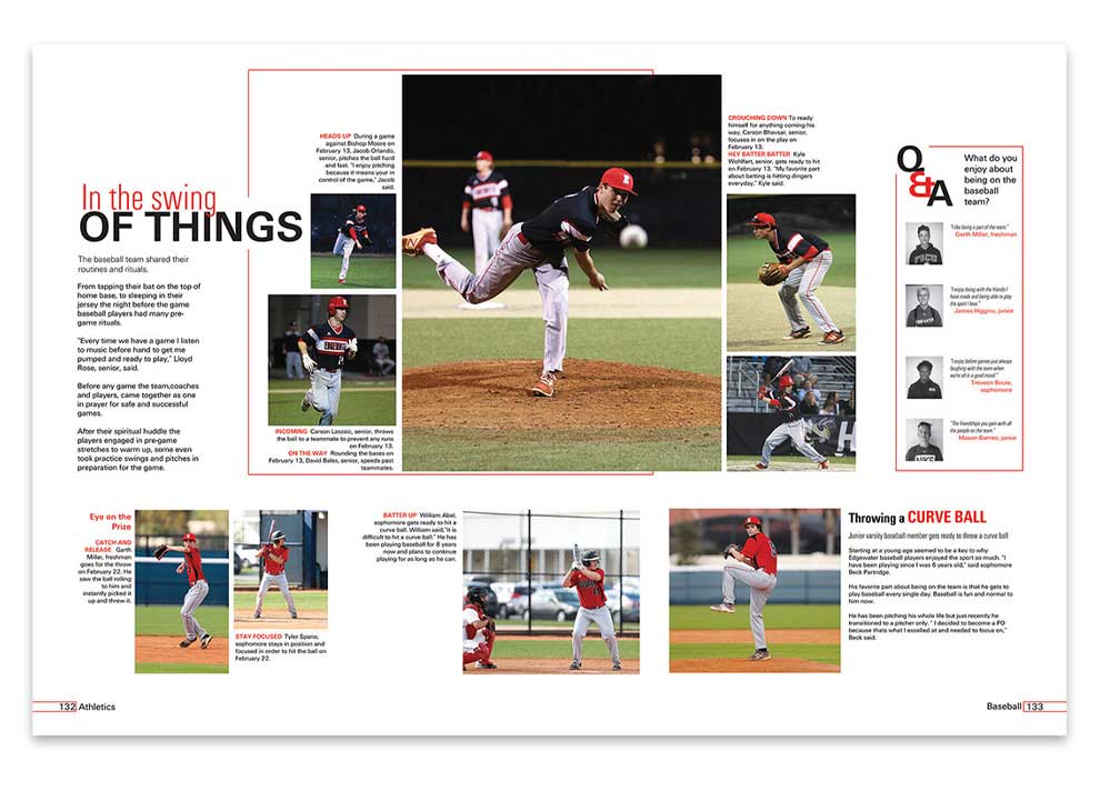
EDGEWATER HIGH SCHOOL
Odasagiah | Orlando, Florida
Adviser: Yvette Passmore
Editors: Jesse Theobald, Sagan Simmons
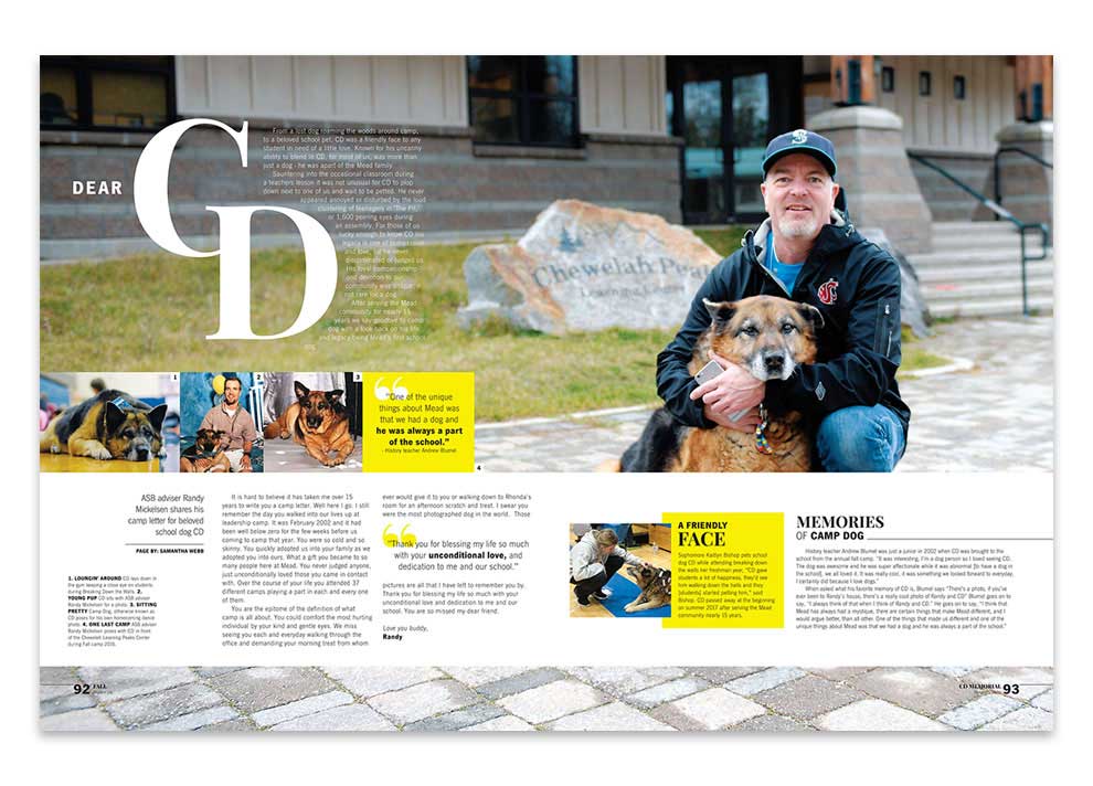
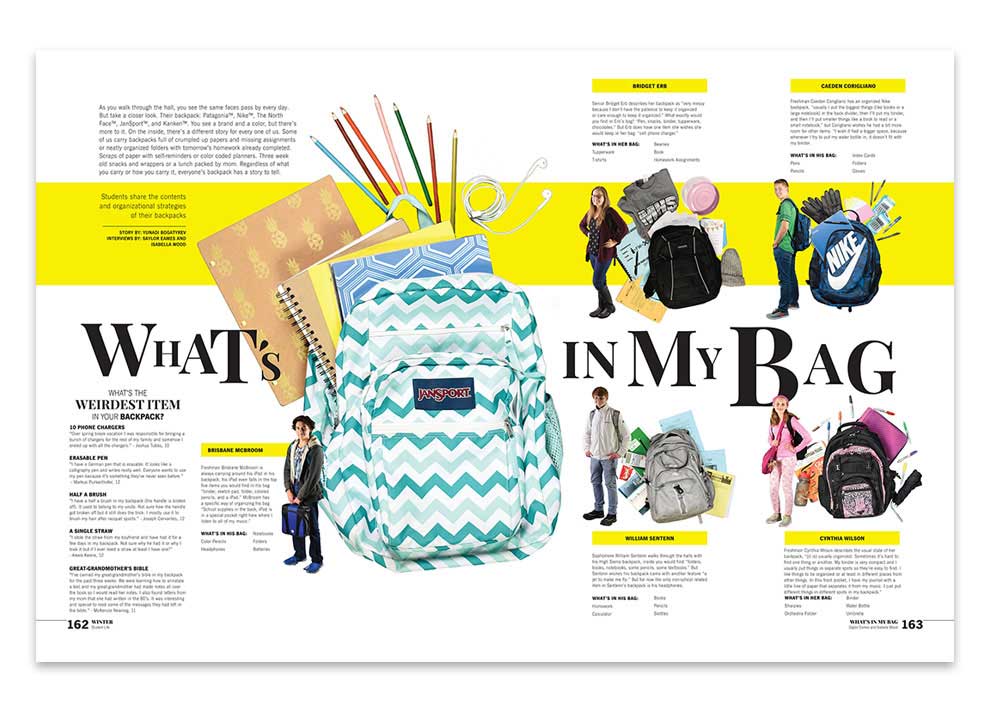
“As the main editor for design, I called on help from a few staff members who had good eyes.
We called ourselves the ‘design team’ and worked hard to help inspire our look. We mainly used Pinterest to get ideas that worked with our overall concept. Last year, some of our staff, including myself, went to a fall workshop run by Jean Henry and Teenie Reddeck with main speaker, Steve Kent, who is the creator of Square One™. There, we learned all about how crucial the design of our book is and how to make it look neat while including as many people as possible.” – Jesse Theobald
Taking the School pride theme one step further, the Odasagiah staff featured school colors — not just on the cover and opening, but on every spread of the book. You’d think it could get a bit ho-hum, but on the contrary, the simplicity creates a clean, open look on coverage spreads. Then, photos and content take center stage. A grid-based design gets the spreads started. Placing a variety of mods keeps them interesting and visually appealing. Divider titles are all words containing “red” as is the book theme, “Rediscover,” which is a simple but effective way to keep the theme going. Theme copy on dividers reminds readers why they’re still “seeing red.” //YBKhq

