
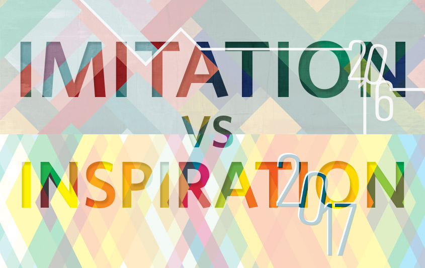
Imitation vs Inspiration
We’ve all heard the old adage, “Imitation is the highest form of flattery.” In some instances, this phrase can be true, however, when it comes to design, imitation is more often a four-letter word that leads to hurt feelings, public shaming or even copyright lawsuits for “ripping off” the original designer’s work. Although those whose work is copied in the yearbook world may not go as far as to lawyer up, most consider it anything but a compliment.
Having a background as a Herff Jones traveling artist and product designer for almost a decade, I’ve seen and worked on A LOT of yearbook covers. While most of my sessions were filled with creative ideas fueled by inspiration, I can’t tell you how many times I’ve sat down with a staff and they pulled out a magazine, poster or even another yearbook and say, “We want this design, but change it to our theme and school colors.” Good people, I give you imitation. Simply changing colors and text does not necessarily make a design your own.
There is nothing wrong with loving a design and gaining inspiration from it. You should, however, avoid copying it outright. Ask yourself WHY you like it. WHAT is it about the design that draws you in? The key in avoiding imitation and using inspiration is the ability to take aspects of a design you love and find a solution to make them work in a new way.
See below for examples of how marketing designers have used inspiration in the process of updating the HJ Litho Design covers.
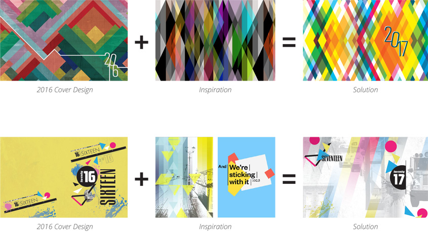
The examples above show inspirational adaptations that involved combining ideas to create another. The great news is that is part of an easy solution. Rather than copy someone’s work, you can avoid all of the issues by changing aspects of the original that allow you to communicate more effectively. By changing colors, shapes, scale, fonts, order and other aspects of the work that inspired you, you can develop answers to your personal design “problems.”
Being a stronger designer is part inspiration, part adaptation and part the willingness to rework until you’re satisfied.
THE EXCEPTIONS TO THE RULE
There are, of course, exceptions to the rule, and those include commonly identifiable elements of design/verbal elements. A great example of this is “Keep Calm and Carry On” — lots of different adaptations of that common phrase, designed like the original, have been created, and that’s okay. It’s relatable to varied audiences, no matter what it says to keep calm about. Another example is Mastercard’s ads that list objects with prices and lastly, closes with a sentimental piece and deeming it “priceless” — we all are familiar with that. When going with one of these popular elements often seen through the window of pop culture, it’s easy to do it the right way. You may choose to incorporate a phrase, icone or device due to its timely relevance. It could help mark your school year. In order to actually resonate with your readers, the design elements have to resemble the original to the point where the play on words and design is immediately identifiable without tons of interpretation. This is a completely different ballpark, and therefore not imitation. The more you know…
INSPIRATION TIP
Curate an inspiration board. Whether it be a Pinterest board, a saved folder of images on your desktop or a corkboard in the classroom, save photos, color palettes and design elements that speak to you. Having these things to shuffle through on the days you’re feeling stuck will help to keep those creative juices flowing.

From yearbook production to traveling artist to marketing designer over the span of nearly a decade, you could say that yearbooks have played a key role in my professional career. My passions include design, illustration, real-fruit popsicles, geeking out with my husband, Dan, about our laundry list of favorite TV shows and daydreaming about our next home renovation.
- Imitation vs Inspiration - April 26, 2016

